Have you ever found yourself saying: “I just need this above the fold so it will be more visible”?
Well, we’ve all been in this situation, but things have changed since 1994 when people were not that used to scroll.
Even if everyone is not willing to admit this, people have learned how to scroll. It’s 2017 after all.
“Above the fold” comes from newspapers because the upper half of a newspaper was where the most important stories and images were added.
But this is the present and there is research that supports the fact that “Above the Fold” is a myth.
Plus, I will show you in this article a better place to put your calls to action (CTA).
Nowadays, we use “above the fold” to mean the visible part of a screen (usually the first 600px) where most people like to stick everything they can to make it visible.
If you are willing to dig into it, you can see what’s below the tip of the iceberg.
Research has shown that while users spend 80% of their time reading the information above the fold, they do know how to scroll. And it turns out that scrolling beats paging, because it’s easier for the user to just keep going down.
Additionally, Bnonn Tennant, who wrote about “Why “The Fold” Is A Myth – And Where To Actually Put Your Calls To Action,” has an interesting perspective on the “above the fold” myth the Kissmetrics blog.
Again, backed by research and testing.
He starts by mentioning research done by MarketingExperiments which got a 20% increase in conversion rate just by moving the call to action from above the fold:
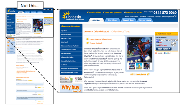
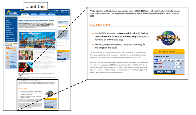
… below the fold.
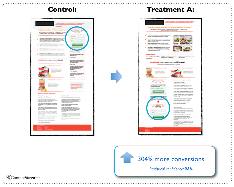
And then he shows research done by Michael Lykke Aagaard from Content Verve (among others) who revealed a test where he moved the call to action (CTA) way below the fold. That move led to a 304% increase in conversion.
Bnonn also mentions that “Higher conversion rates have nothing to do with whether the button is above the fold, and everything to do with whether the button is below the right amount of good copy.” I completely agree with him.
If you do a good job writing good copy that will keep your visitors engaged, it will have a positive return for you.
A CTA always does better if it’s accompanied by some really well written copy.
Chris Lema also ads some compelling reasons why we should stop talking about the fold.
Now, let’s see how you can apply this to your website and what is the best place to add your calls to action.
How does this apply to your website?
Based on some of the above research, last year after I redesigned my website, I decided to do my own research on this topic.
I started by getting myself an account with CrazyEgg and installed the tracking software on my blog.
After the website received a fair amount of traffic (over 1,000 visits) I started to look at heatmaps. They looked like this:

You can see that most of the visitor’s attention is essentially below the fold (look for the brightest areas) and interest areas, such as the email signup form from the top of the sidebar, are essentially invisible for them.
This was the point when I started to think at what I later called the “Cloud Box”.
What is the Cloud Box?
The Cloud Box is essentially a floating box generated by a script, which moves along with the reader when reading an article.
You can add some code in a text widget, link it to a script and boom! there you have it (read more and I will show you how to create one for yourself).
You may not know this yet, but you are already familiar with the Cloud Box. You have already seen it just by looking at the right sidebar now.
However, I am not the only one that is using this. It has been successfully used by Neil Patel on his QuickSprout blog…

… and on the The Daily Egg, which is CrazyEgg‘s blog.

In one of his articles, when talking about how you can convert blog readers into customers, Neil even mentioned the fact that the ad he has in the Cloud Box gets clicked on 2.58% of the time.
And if you compare this with .94%, the CTR (click-through rate) of the static ad in the sidebar of the same blog, that’s a difference of 274%.
Just think about improving your CTR with 274% or 670%!
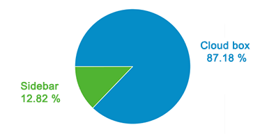
For my ads, out of the total traffic that this site sends to Elevatr through the sidebar ads, 87% is being sent by the Cloud Box. This is essentially 670% more traffic than the static ad from the top of the sidebar sends.
But it’s not just for ads!
I found more smart people who use this with success, such as the Freshome blog.
Mihai Micle, the founder of Freshome, says that he has seen significant improvements for the Pinterest and Facebook widgets.
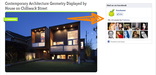
You can get really creative with this and add quite anything you want to promote on the Cloud Box, such as:
- Twitter follow buton
- Facebook like widget
- Pinterest button
- Your about me/us information
- Information about your products
Essentially, anything that you want to be more visible for your readers.
But it’s important to rotate what you promote in the CloudBox because people get “widget blind” and will not see it anymore.
This way, your visitors will always have something new to interact with.
That is why Mihai started with a Pinterest button, now he uses a Facebook like widget and at some point he may use that spot for ads.
Additionally, you may have noticed on the Kissmetrics blog a call to action to signup for the Kissmetrics app, which I bet will be effective if they keep it there.
What Happens When the Ad is Replaced With an Email Cloud Box?
This one of the first things I was thinking about when working on Elevatr.
Elevatr is a premium WordPress plugin that helps you easily create signup forms and one of my goals was to also have a Cloud Box.
Before Elevatr, I was successfully using the cloud box on my blog for list building and kept adding people to my email newsletter by adding the Email Cloud Box manually.
But after I launched Elevatr, more people started to use it, like Henri Junttila from Wake Up Cloud.
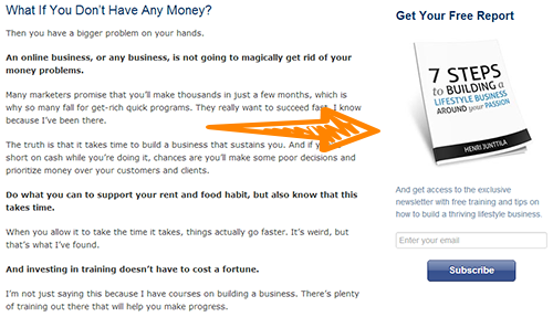
He started to use Elevatr soon after I launched it and just in January alone, the Email Cloud Box was responsible for 15% of his subscribers.
But, you should be aware of the fact that Henri had already optimized his blog during the most recent redesign and placed the signup boxes strategically.
How to Create Your Own Cloud Box
Now, because I am really happy with the results that the Cloud Box can bring, I want you to be able to use it.
So I put together the code that you need and a short tutorial on how you can add it to your website below.
First, you will have to download the following JavaScript and upload it to a directory called js, within your theme folder (wp-content/themes/your-theme/).
If it doesn’t exist, just create a new one and upload the file to that location (wp-content/themes/your-theme/js/).
Again, just to make sure that you get it right: download the following file and upload it to wp-content/themes/your-theme/js/.
Remember to unzip the file before you upload it.
Next, you need to add the following code to your functions.php file. You can do that from [Appearance > Editor] in your WordPress admin account. But please do this with caution as if you delete something from this file, you can break your website. In case you are now familiar with this, please ask someone to do it for you.
Finally, all you have to do is just upload your ad image and include it in a text widget at the bottom of your sidebar.
Here’s an example of what I use for my Elevatr ad:
Just copy the above code and paste it in a text widget after you replace the links.
What About an Email Cloud Box?
If you want to have an Email Cloud Box in your sidebar, all you have to do is just replace the link and image with your signup box code.
Remember to keep the code within the tag.
Looking for an easier way of adding the Email Cloud Box?
In case this looks like a language that someone from Mars is speaking or maybe brain surgery, then you may want to look at a simple way to do this.
And yes, there is a simple way of adding an Email Cloud Box to your sidebar and get more subscribers.
You can actually create an Email Cloud Box with my premium plugin, Elevatr and it should take you about 5 minutes to do it.
With Elevatr, all you have to do is just connect to your preferred email marketing provider (MailChimp or Aweber + iContact coming soon) using your API key and choose Cloud Box while building your form.
And creating the form is a darn easy process – just point-and-click.
You should check out Elevatr today.
Back to you
Before I ask you to go and try this, what are your thoughts about the “Above the Fold” myth and the Cloud Box?
I would love to hear your opinion.
So, once you leave a comment below with that go and test the Cloud Box and then come back to let us know your findings.
Eugen,
Wow you have raised so many issues that we need to address with our website and the “above the fold” bit was just a small part of the improvements we need to make after reading your excellent post.
Unfortunately we are not very technical and English is not our main language here in our remote Thai village but I have printed 4 of your posts out and will go over them slowly to make sure I understand the main points you give. Thank you for sharing and I have subscribed to make sure I don’t miss any more of these valuable posts.
Amnuai, I am happy that you found the information useful. And thanks for subscribing!
Wow.
Before reading this I didn’t even know what a cloud box was. Now, I’ve quickly added one to my primary side bar!
Thank you, Eugen. Great information.
It looks really good, Henneke! It’s great to see the Email Cloud Box on your site.
I haven’t tried a cloud box before, and honestly I’m not sure why. I think I’ll start slipping them into a few sites and see what kind of difference I notice.
I think this post picks up brilliantly where Chris’s post http://chrislema.com/above-and-below-the-fold-stop-talking-about-the-stinkin-fold/ left off.
Thanks Eugen and great job with Elevatr — it is so nice to see a floating sidebar box that is actually very well designed. Kudos.
Thanks so much, Heather!
Eugen – thanks for a very informative post. The above the fold issue is a very interesting one and reinforces the point that good content is vital.
Exactly! Good content is vital for a website to become successful.
Eugen, great article. I think I might try the cloud box.
But first tell me, how does the cloud box compare to the pop up? I’ve had great results with pop ups. In fact when I switched themes last month, I forgot to reinstate the pop up and I had a dramatic drop in newsletter sign ups.
Marlene, I haven’t compared the Cloud Box with a popup, but I will do it as soon as we implement it to Elevatr.
However, I tend to think that a popup will have better results because it’s straight into your face.
Great info about the Cloud Box, Eugen! I should try this soon on my website. I am selling courses and the call to action will come in handy following the user scrolling. Thanks for the article!
It’s a pleasure and I am happy that you found it useful.
Very thought provoking, Eugen. As a former newspaper production manager, I’ve always accepted the “above the fold” as gospel. Now you’re making me question it, which is a good thing. I’m also interested in trying the cloud box. Perhaps I’ll give it a test on my new WordPress Building Blocks site.
Thanks!
Most probably things have changed in time. But do give a go to the Cloud Box and let me know the results.
I wonder how this would work for ecommerce. I sell fine art and my pieces can be pretty expensive and therefore require more copy for reassurance and persuasion.
My current setup is the default product image left and add to cart right.
Unfortunately I don’t have enough traffic to AB test. It’s a new site.
Thoughts?
Matt, I would keep your existing setup until you have more traffic to test, but I will also add more copy to your product pages and add another call to action below that copy.
This way, those that need convincing before purchasing can take action immediately.
My background is direct marketing and when creating landing or salespages I always use second and third call to action buttons and texts. Great integration of “above the fold” and “Above the fold myth” 🙂
Great article. THANK YOU
Definitely had always taken the above the fold as a rule of thumb…my conversions always seemed to be aligned with the above the fold/heat map theory but I have never really tested it on a longer more engaging piece like a sales page. Intuitively it definitely makes sense that the more content someone reads the more likely they are to take the next step. Thanks for blowing my mind today!
Jon, I am really happy to hear that this helped.
I would strongly recommend you to also test with a longer sales page.
It just occurred to me another example that uses long copy for the sales page: the homepage of CrazyEgg.
They tested a couple of variations and the long copy converted best.
Great read Eugen, love the stats/figures to back up your comments as well. I will definitely be pointing some of my clients here, who still swear that I have to squeeze everything including the kitchen sink above the fold! :o) “People have learned how to scroll. It’s 2013 after all” – gave me a chuckle. Thanks.
Thanks, Josh!
I am really happy that you found this valuable.
By the way, I like your stuff.
I whole-heartedly agree with your point on the myth of the fold. However, I think this blog got sidetracked with what you are calling a cloud box.
Rather than talking about concrete places to put calls to action and important information, (like above the fold, in a sidebar, at the bottom of a page, etc.) we should be really be focusing on placing the information where it makes sense.
Use analytics and strategy to determine where things should be placed on YOUR website. That’s the approach that will yield the best results.
Bryce I agree with you and while I share research and showcase what works for me, I always recommend people to test anything they want to change to their website.
Really like the way the Elevatr box remains on the right sidebar while you scroll down the copy. Very clever and very effective.
Thanks Scott!
Thanks Eugen 🙂
Hello Eugen, the Cloudbox is awesome. I’ve been using it on one of my blogs. However, I implemented it through a plugin since I’m using WordPress. There is one plugin I’ve been using for a few months now that works really well. If anyone interested to take a look at it, it’s a free WP plugin available at WP.org….
wordpress dot org/extend/plugins/q2w3-fixed-widget/
(replace dot with . and remove spaces)
The plugin is very helpful for those who are non-code junkies.
I am a fan of less plugins and this is the reason why I shared the code.
But if anyone would rather use the free plugin you mentioned, I would invite them to do it.
One of the best articles, really thorough read! And never mind, a really nice looking blog you have here. – Ron.
Thanks for your input, Ron!
Useful post, it definitely makes sense considering that I am unlikely to convert through a ‘call to action’ before understanding more about the offering and by reading a bit of the page.
Have you seen examples of multiple cloud boxes? It probably isn’t a good idea to have more than one solid ‘call to action’. Curious as to whether this has been done effectively.
You can add multiple items in a Cloud Box, that I am sure of, ie: a signup form and some social proof.
Amazing insights, thanks! This is why landing page design should always be tested and performance measured. Best practices and myth can hurt you 🙂
Definitely! You should always everything on your landing pages and see what converts best.
Hi Eugen
I have been desperately looking for a Joomla based Cloud Box solution, can you give me a lead?
Gilad, you can use my instructions and code from the article to add it to your Joomla site.
The code will be the same and the only thing that different is the place where you add the Could Box, ie Widgets for WordPress.
Its so crazy, a colleague and I were discussing this exact topic just the other day. He uses a huge screen for developing, and has access to way more of the page than I do on my teeny computer screen. We will definitely be considering these factors going forward.
Thanks for the article.
I always test a design on multiple screens and I use tools to also check how the website looks on mobile.
I’ts good to also look into that.
Hi Eugen,
This plugin looks great!
I feel brave enough to try uploading the java scripts and adding it to my functions file.
What would be the difference in speed vs. the plugin? I’m trying to get away from using so many plugins.
Yet, if something needs to be updated, it’s certainly easier with a plugin.
Amazing idea! Quick question… how do you disable the movement on mobile? I’d prefer it remain static on mobile. Thanks!
The improvement of conversions with a moving box on the sidebar are quite impressive. But, it also makes a lot of sense. Nowadays, most people have seen pretty much all of the “tricks” and the internet is getting more and more about providing value…
A reader sees a captivating headline – he continues reading – he thinks: “what an amazing article…” – some sort of trust relationship with the blogger is in the process of getting established – and there is this great offer on the sidebar…
A signup or conversion at this point is much more likely
Hi Eugen,
First of all I just want to say that your site is awesome, a lot of epic content on here 🙂
This post is great, didn’t know what a Cloud Box was before reading this. I just launched my personal branded site and this may be something I will look into adding on there 🙂
All the best
Navid
Great article; fodder for the weekend. Thanks.
Excellent post, really specific. I’ve learned a lot from this walkthrough of sorts. Cheers, T.
Thank you for sharing the Elevatr plugin. I’m a BIG fan of tools, resources, and plugins and have now added Elevatr to my collection 🙂